designer, linguist, creator

I blend interaction design, language, and systems to shape how products speak. Now I’m digging into how we interact with AI, and how we measure voice quality.

I redesign the system, then I ask, “How much further can we go?”

More about me →

selected work

5 CASE STUDIES
Indeed logo
01

weekly job summary

SUBJECT LINE A/B TEST

Rewrote the opener for Indeed’s core lifecycle email, and clicks rose 49%.

DIVE IN →
02
trusted friends
ROBLOX / REFRAMING SOCIAL IDENTITY
Renamed Friends, endured global backlash, then helped bring it back.
Read →
03
content systems for AI
roblox / CONTENT AS INFRASTRUCTURE
Established Roblox’s voice, content, and style guides in 1 month. Turned them into an AI assistant in 3.
Read →
04
moments
roblox / SHORT-FORM CONTENT DISCOVERY
Took a short-form video feed 0→1, getting players to find new games.
Read →
05
qualtrics assist
qualtrics / design & tone FOR CX AI
Redesigned AI voice settings and the rubric that scores its replies.
Read →

foundations

Systems under the work: standards, libraries, and guides.

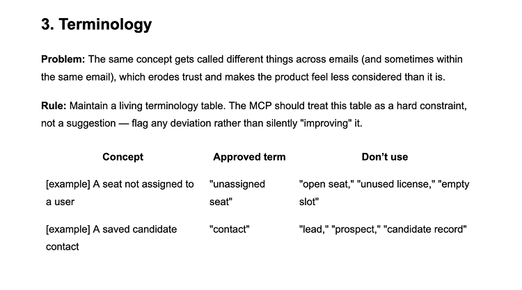
Terminology section of Indeed’s email content framework: the problem, a rule that the content design MCP treats a living terminology table as a hard constraint, and a table of concepts, approved terms, and terms not to use, such as “unassigned seat” instead of “open seat”.
INDEED

email content framework

A framework for Indeed's content design MCP, with a consistent POV on email copy.
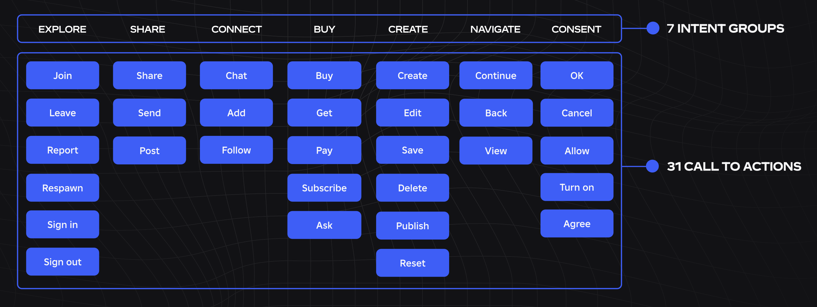
Grid of Roblox CTAs sorted into 7 intent groups: Explore, Share, Connect, Buy, Create, Navigate, Consent. 31 calls to action in total.
Roblox

unified CTAs

A CTA system for easier, familiar, and consistent navigation.
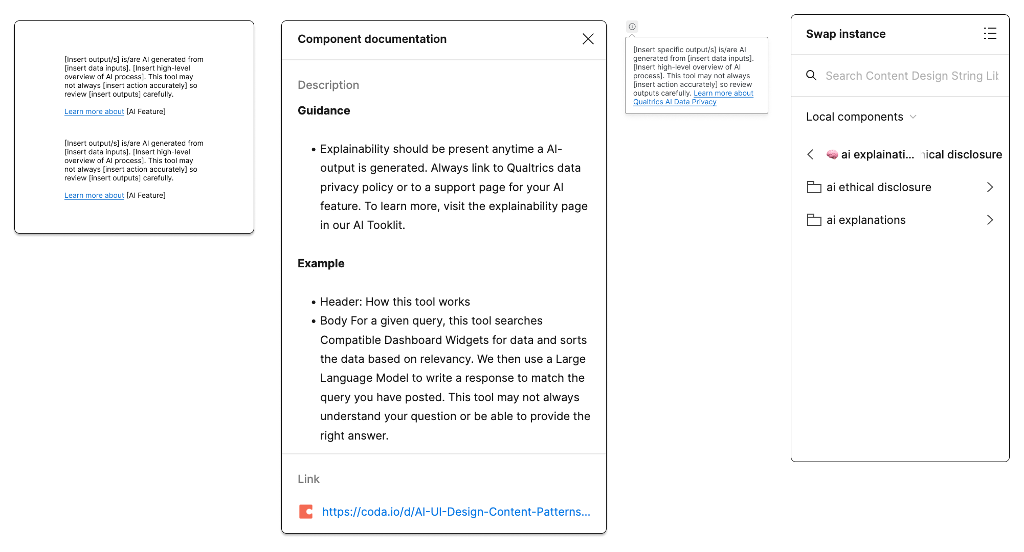
Qualtrics content design string library in Figma: AI disclosure string templates, component documentation with guidance and an example, and the swap instance panel.
Qualtrics

string library

An integrated library and design system, for all designers.
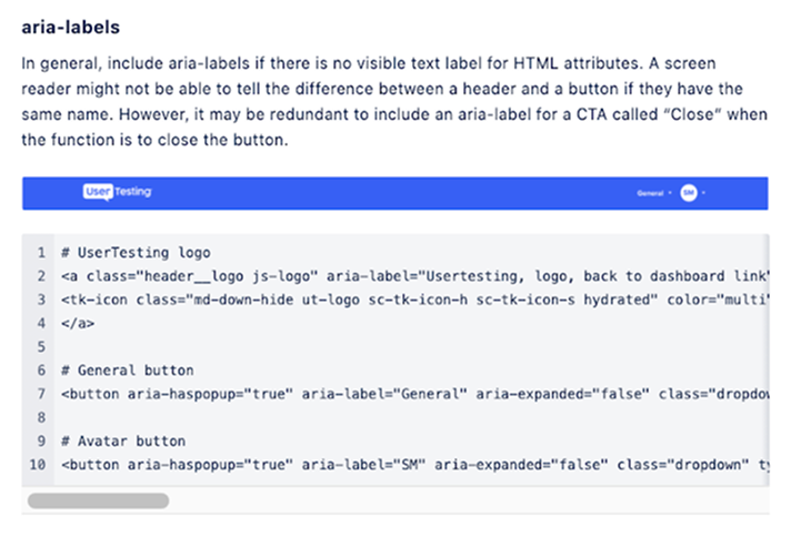
UserTesting accessibility style guide page on aria-labels, with a code example of labeled header buttons.
UserTesting

accessibility style guide

Best practices for accessible + inclusive language. WCAG 2.1.

caught your eye?

Let's chat over coffee, tea, or whatever you fancy.

© 2026 ALL RIGHTS RESERVED
IN WRITING MODE

bonjour, hi

Something I picked up in Montreal cafés.

Like any 21st century writer, I got my start on Wattpad.

I never thought I’d be a writer for a living—so when my plan to become a computational linguist went awry, I returned to what I knew: words.

But I’m used to pivoting and making sense of ambiguity. I make systems where there are none, toil until they stick. You'll spot personal touches through all my work, and I always strive to raise the bar for users, my team, and myself.

Black-and-white portrait of Sarah

experience

DESIGNING SINCE 2020
2026 – NOW
Indeed
Senior content designer, helping employers hire.
2025 – 2026
Roblox
Founding content designer, built foundational and AI systems.
2022 – 2025
Qualtrics
Content designer for Text iQ, CX, and AI.
Autumn 2021
Wish
UX writer intern, primarily on Wish Local.
Summer 2021
UserTesting
UX writer intern, specialized in accessibility and inclusivity.
2020 – 2021
WEX Inc.
Technical writer, updated WEX's highly technical voice.

Ask me about any of these experiences, or…

…what book I’m reading now
…my time as a radio show host
…the screenplay I’ve yet to put to page

what others say

Sarah is a true rock star. A sharp designer and champion of clarity, she defines what it means to be a multidisciplinary designer and Qualtrics at large benefits from it. I’m so grateful to work with her!
— STAFF PRODUCT DESIGNER, QUALTRICS
Sarah exemplifies the ideal content designer, blending creativity, technical skill, and commitment to collaboration. Her contributions not only shape the content itself but enhance the overall design process, making her an invaluable asset to any team.
— SENIOR PRODUCT MANAGER, QUALTRICS
She masterfully conveyed a challenging concept in prototype with limited space for content that left customers with no further burning questions on machine learning like we’ve had in the past.
— STAFF UX RESEARCHER, QUALTRICS
01 / 03
02 / 03
03 / 03

caught your eye?

Let's chat over coffee, tea, or whatever you fancy.

© 2026 ALL RIGHTS RESERVED
IN WRITING MODE
SUBJECT LINE A/B TEST
01 / 05

weekly job summary

Scope
Content design
Company
Indeed
For
Employers across all monetization streams
With
UX, product, marketing

Hitting 49% more clicks with two lines of copy.

The Weekly Job Summary is a core lifecycle email reaching 550K+ employers per week. It drives ~1,700 lifecycle-spender conversions per month across upsell and reactivation streams. But according to UXR, employers wanted a more action-oriented and personalized subject line.

So we built an A/B test variant incorporating both.

I led the subject line and preheader, from feedback synthesis to the final test copy.

what employers asked for

Likelihood-to-open was low. A concrete subject line would earn the open, not a generic "weekly update."
PREDICTION
Expect a lift
Hypothesis
Adding action-oriented and personalized language to the subject line will increase the open rate. Since the change reflects direct employer feedback, a neutral result also warrants rollout as a CX improvement.
Metric
Email open rate
Audience split
Control: 50% · Test: 50%
Winner criteria
A neutral or positive result after 1 weekly send will be enough to declare a winner.

workshopping the line

Feedback
Employers
Prefer a subject line that includes a problem or something they need to take action on (e.g. 6 candidates waiting)
Claude
Personalization boosts open rate; numbers and specifics outperform vague language
SENIOR PM
Personalization aligns with direction from leadership
UXD
Use “jobs,” not “roles”; be careful with using “perform”
Current
Weekly Job Summary
Ideas from the team
⚠️ Your weekly job status — recommended next steps inside
Advised not to use the warning icon
Hiring update: Here’s where you stand and what to do next
Too many alts to choose: Job update, jobs update, job post updates
This week in hiring at {Company Name}: results + next steps
Personalized, but not yet right
{Company Name}, check in on your job status
My idea
For an evergreen email like this with a high open rate, will a new subject line confuse them?
— SENIOR PRODUCT MANAGER

The neutral or better winner criteria were the answer, because if habit kept open rates flat, the change still rolled out as a CX improvement. Later, the results showed employers weren’t confused.

…and the preheader

Our international lifecycle marketing manager offered 3 alternatives, each giving a preview of what to expect from the email. I pulled the most important bits from each into one.

Track your job activity and posts on Indeed
Catch up on your applications and key insights
Job performance and recommended next steps are inside
MY VERSION
Catch up on job activity, key insights, and next steps

what changed

Only the subject line and preheader differed, while the email body stayed the same.
The test adds the two elements employers asked for.

Control
Indeed
Weekly Job Summary
This is what your week looked like on Indeed
Descriptive and static, w/o personalization or a call to action
Test
Indeed
{Company Name}, check in on your job status
Catch up on job activity, key insights, and next steps
Personalized and action-oriented, exactly what they wanted

exceeding expectations

44.61%
+6.9% vs. control · open rate
6.85%
+39.7% vs. control · click-to-open (CTOR)
3.05%
+49.3% vs. control · click-through (CTR)

Those who opened the email were far likelier to click. A clearer, action-oriented subject line set accurate expectations of what's inside. Catchier subjects were usually risky at Indeed, but here, it resulted in more clicks. 

the lift landed on the CTA
+35.3%
+1,252 vs. control · clicks on View candidates
~48%
Share of the clicks from 1 CTA
–17.8%
Unsubscribe clicks: fewer opt-outs

View candidates rose 4–5× the other main CTAs. The test specifically pushed more employers to review their applicants, the action “check in on your job status” invites. The framing delivered on its promise.

setting new defaults in my first month

Each lift was steady with a clear business impact: 49% more clicks per email. My versions are now the default for Weekly Job Summary campaigns.

Throughout my work, you’ll find me as the first or founding content designer and teaching partners how to work with me. Indeed didn't have email-specific content design, so I made an email-specific framework. The Weekly Job Summary was the most significant campaign I partnered on, and altogether they formed how I structured Indeed’s email content framework, then trained its internal content MCP.

NEXT
trusted friends
Read →

caught your eye?

Let's chat over coffee, tea, or whatever you fancy.

© 2026 ALL RIGHTS RESERVED
IN WRITING MODE
REFRAMING SOCIAL IDENTITY
02 / 05

trusted friends

SCOPE
Content design, strategy
Company
Roblox
For
151.5M+ creators and players
WITH
PM, PMM, legal, safety

Rethinking social relationships while still sounding human.

Friendships are what make Roblox, Roblox. With 73% under 18, users stay for the friends they’ve made and the identities they’ve formed.

However, parents worried bad actors had unfettered access to their kids via the Friends system. To make the platform safer, Roblox explored a social overhaul: Friends become Connections, with Trusted Connections as an age-verified layer for close friends.

I led content design on the initial rename and made the early case for Friends.

I was the first content designer on the project, defining early framing and content direction.
After I left, the feature was relaunched with final copy by the team.

understanding the terms

The team thought “Friends” didn't accurately reflect the levels of trust in a network, so this update was meant to be more flexible and safety-conscious. As the first content designer, I evaluated the naming system while advocating for language that matched users’ mental models.

And as a lifelong gamer, I tapped into my personal passion to speak to them—game devs, content creators, players of all ages.

friends
Two people agree to be Friends, like in real life. Standard across other gaming and social platforms.
They could
  • Send and receive messages, Party invites
  • Join each other's private games
  • Or remove each other
connections
Would replace Friends, with the same features seen through the lens of connection.
THEY CAN
  • Do everything Friends could, under a new name
trusted connections
A person’s inner circle, like Close Friends elsewhere. Both people must be age-checked, 13+.
They unlock
  • Unfiltered chat and voice chat in parties
  • Live collab on games with Team Create (Roblox Studio)
  • Content made by Trusted Connections and game customization
launching alongside
KIDS UNDER 13
Require parental approval to add TCs
TEENS, 13–17
Can add adults via QR code or contacts
Voice & chat
Exclusive to private chat between TCs
SAFETY & MODERATION
All chat moderated for severe violations

This still led to the biggest risk: backlash to Connections.

the trouble with connections

The name was a fit on paper, but content design had neither presence nor input in research. The team prepped for launch and only asked for copy changes when I joined, but I pushed back. "Connections" didn’t match established social identity, and Friends + Close Friends were staples on gaming platforms.

The change risked making core interactions feel abstract, institutional, and emotionally distant.

My recommendation wasn't adopted before launch. In July 2025, the rename launched as-is.

Two Roblox Home screens. Left: the Connections (17) row with a Connect button. Right: a sheet titled Introducing Connections explaining that Roblox Friends are now Connections and that age-checked users 13+ can unlock expressive chat.
Connections on Home, shipped copy not written by me
They don’t manage connections—they make friends.

an unsuccessful launch

Connections + Trusted Connections launched to significant backlash. From dev forums to YouTube, Roblox players asked why Friends was replaced. In attempting to bridge the safety gap, it brought feelings of disconnect, distrust, and disregard.

They feared Roblox was becoming LinkedIn.

DevForum post from July 2025: “Let’s connect!” gives LinkedIn vibes, with a screenshot of LinkedIn’s Connect, Message, and More buttons.
01 / 04 · ROBLOX DEV FORUM
A player’s Roblox Home screenshot with an arrow pointing to Connections (76) and the caption: Are you fr, Roblox?
02 / 04 · REDDIT
Meme of two glowing brains facing each other: how roblox feels after they renamed “friends” to “connections”, with a broken heart.
03 / 04 · TIKTOK
KreekCraft YouTube video titled Roblox, Are You Stupid?, 897K views: roblox is replacing friends with connections in a new update.
04 / 04 · YOUTUBE

Scroll →

growing pains in a mature org

1 → 4
The content design team quadrupled in six months

After launch, our biggest hurdle was changing how the org thought about language.

Content design was new to most partners. Some welcomed us; others stayed skeptical until we’d built up wins across the product. I spent a lot of time explaining my job, like walking through my process, setting standards from scratch, and building reusable frameworks.

the case for everyday language

Across product, legal, and safety, formal language was the safe choice. I made the opposite case with every partner, that the words people already use are the ones they understand, trust, and act on. Everyday language is how safety actually lands, and every win we had made it easier to bring back Friends.

round 2 / trusted friends

The issue was always Connections—too formal, too detached, too unlike Roblox to its audience of millions.

Strategy

just bring back friends

It still aligned with safety initiatives, the new voice and tone, and user mental models.

ORIGINAL
friends
RENAME
connections
trusted connections
SPRING 2026
friends
trusted friends
New naming system
Same as Trusted Connections, with added parental controls
Not a proper noun
MORE CONTROLS FOR PARENTS
Connected parents are their child’s trusted friends, automatically
Trusted friends can be siblings, cousins, and IRL friends, approved by parents first

how it landed

This isn’t a joke; Roblox actually changed their mind.
— KREEKCRAFT, 17.3M SUBSCRIBERS · YOUTUBE
friends were back
The term players used, from the beginning, had returned.
roblox was listening
Many saw the change as their voices finally being heard.
Four screens of the trusted friends flow: Share QR code, Scan QR code, an Add trusted friend sheet showing robofrog is age checked with Add and Don't add buttons, and a notification that robofrog accepted your trusted friend request.
Adding a trusted friend via QR code or request

After years of unpopular platform decisions, players saw proof that their voice could change the product.

empathy in practice, not just principle

Product language profoundly shapes emotional perception and trust, especially in social platforms where certain terms carry cultural and behavioral meaning. Safety-driven systems still need to sound human, and users still need to feel heard.

Successful platform language must balance business goals with how users naturally describe themselves and their relationships.

NEXT
content systems for AI
Read →

caught your eye?

Let's chat over coffee, tea, or whatever you fancy.

© 2026 ALL RIGHTS RESERVED
IN WRITING MODE
CONTENT AS INFRASTRUCTURE
03 / 05

content systems for AI

SCOPE
Content, conversation, model design
Company
Roblox
For
Anyone in design, product, or eng
With
Product, design, design eng

Making content systems the foundation for an assistant.

Builders—Roblox employees, basically—lacked quick, reliable support for writing UX content. Our nascent content design team couldn’t scale to review everything ourselves, and we needed to empower non-content designers to make high-quality, consistent copy on their own.

Meanwhile, the design org was rapidly innovating an AI design system with an internal companion, Design Assist, for Figma and Slack.

We saw an opportunity for content design functionality in Design Assist, and to treat content systems (voice, tone, heuristics) as infrastructure other AI tools could build on. With non-content designers empowered to write copy themselves, we’d be free to focus on strategic work.

I led the foundational work and designed how the assistant would put it to use.

a voice without guidelines

The first step was training the assistant on content guidelines, but we didn't have any.

Roblox's voice and tone did exist, for brand. It just didn't translate into how the product should actually speak. And since we didn't have years of content design docs to draw from, we adapted the brand voice and tone.

We prioritized the surfaces Builders wrote for most (buttons, errors, upsells) and foundations (voice, empathy, style). I owned the foundational guidelines.

the guidelines
HOUSED IN CONFLUENCE
01
Product voice & tone
CONFIDENT, INVITING, AUTHENTIC, OPTIMISTIC
02
Writing with empathy
03
Style & punctuation
04
CTAs
05
Error messages
06
Notifications & tooltips
07
Upsells & monetization
08
Accessibility & inclusivity
09
Design heuristic evaluation

Every other page, and later the assistant, measured copy against the product voice.

written for two readers

Guidelines were written with a principle, an instruction, a do-and-don’t pair, and why it works. Brief for eyes to skim, consistent for a model to find and apply.

A CTA, an upsell, or an error message could all be checked against the same voice and tone: confident, inviting, authentic, optimistic.

anatomy of a guideline
A real entry from CTAs.
Principle
Lead with a verb
Instruction
CTAs are action-oriented, so lead with a verb that reflects what the user is doing.
Do
PublishView detailsAsk
Don’t
DoneLearn moreRequest
Why it works
Verb-first actions move the user forward and align the button with their intent.
CONTENT ASSIST, DESIGNED BY ME

the first prototype

A mockup of how it'd talk to you on Slack, built to test tone and conversational flow.

AI-portrait Mona Lisa wasn't shipped.

Having a base to work from, we moved to Design Assist, a RAG-powered assistant connected to our Confluence hub and shipping as a Figma plugin and Slack app. Slack couldn't support the prototype's back-to-back messages, so we simplified. Conversations start when you open the app, and quick actions follow each response to keep the exchange going.

IN FIGMA

The agent scans text layers for standard violations, offering inline suggestions and linking to relevant guidelines or past discussions.

IN SLACK

Builders submit content for review and get suggestions based on our standards. Content designers refine suggestions for the agent to learn from via self-tagging docs.

designing for trust

Each behavior from this assistant traced back to a line in its system prompt:

The assistant should be
SO THE PROMPT SAYS
collaborative, not prescriptive
Never overwrite unless asked. Respect the original intent.
helpful, not performative
Always explain your suggestions. Be friendly and constructive.
transparent about its limits
If you’re unsure, flag the issue and suggest the user consult a content designer.
consistent with our standards
You follow Roblox’s content standards for voice, tone, grammar, clarity, and accessibility.
in practice
Voice and tone check
User asks whether copy fits the audience.
User
“Is this the right tone for a 13+ audience?”
You’ve almost got it! Just a few more steps.
Assistant
“This is friendly, encouraging, and optimistic, which works well for 13+ users. You could say Almost there, just a few more steps. to be more concise.”
When a guideline applies
A real question from a designer, used to train the assistant.
Suggestions point back to their derived page.
User
“Should Avatar be capitalized everywhere? I’m seeing a button that says Switch Avatar.”
Assistant
“Use sentence case: Switch avatar. Avatar isn’t a proper noun, so only capitalize it at the start of a sentence or label.”
Style & punctuation

when it broke its own rules

Early outputs didn't sound like us. The assistant recommended title case for headers and CTAs, the exact pattern our style guide ruled out, and peppered its guidance with exclamation points. Revising the system prompt, I got more specific to show what our voice sounded like.

system_prompt.md
added rules
More foundational behavior for the assistant.
Specific rules to follow:
- Use sentence case (not applicable for proper nouns).
e.g. Do: Today’s picks / Don’t: Today’s Picks
- Use a verb-first format for button text.
- Accessibility (EAA/WCAG):
- Link/Button text: Must be descriptive and standalone.
e.g., Do: Download PDF guide / Don’t: “Click here”
- Image context: If the content refers to an image, provide a descriptive alternative text.
- Structure: Use a logical hierarchy and avoid using only color to convey information.

zero to shipped in record time

1 month
to write the guidelines
3 months
to ship Design Assist (beta) in Figma + Slack
Design Assist in Figma, reviewing and applying suggestions
Design Assist app in Slack answering a question about when to use a tooltip versus a coachmark.
Design Assist in Slack, answering a novice design question
01 / 02
02 / 02
fewer review requests
Builders got answers in Slack and Figma first, freeing content designers for strategic work.
no more waiting on a reviewer
Suggestions arrived in the thread or inline on the layer, each tied to a guideline in the library.
built to outlast us
After I left, the next content design manager built a Claude skill on the same guidelines.

guidelines built for the assistant

Starting from zero meant designing for the assistant from day one. Now I start every content system the same way: if a model can't apply it, it's not done.

NEXT
moments
Read →

caught your eye?

Let's chat over coffee, tea, or whatever you fancy.

© 2026 ALL RIGHTS RESERVED
IN WRITING MODE
SHORT-FORM CONTENT DISCOVERY
04 / 05

moments

SCOPE
Content design, strategy
Company
Roblox
For
Creators and players, aged 16+
With
Design, DPM, PM, product marketing, eng

Bringing short-form content discovery back to Roblox.

Players always captured their gameplay, but they left Roblox to share it. On YouTube, viewers clocked 1.5 billion minutes of Roblox content a day, and #roblox was one of TikTok’s fastest-growing hashtags. On Roblox itself, beyond playing and customizing avatars, players had little outlet to create.

Developers felt it too. Promoting a game through authentic, player-made content was difficult, and discovery felt stagnant. They needed better paths to reach new players.

Moments fix that: clips up to 30 seconds, swipeable feed. One tap takes you from watching to playing.

I led end-to-end content design for creation, safety, and consumption.

a few challenges
No hierarchy
Moments, captures, and posts were used interchangeably, with no semantic hierarchy tying them together.
AGE-GATED EXPERIENCE
Only older teens and adults could use Moments, so clarity and safety came first.
Safety logic
Restrictions had to show up in UX copy without overwhelming anyone.
success measured by
GROWING
Content-driven game joins: new and returning players discovering games via videos
More frequent sessions, with short “downtime” visits alongside longer play
More time spent on Roblox
GUARDING
Watching shouldn’t cannibalize playing
Less violative content created and seen

landing on moments

Internally, the project was called Rodeo (Roblox Video). The team oscillated on what to call them—Clips, Highlights, Rodeos? Leading content design here, with no naming system or semantic hierarchy to lean on, I had to create one.

"Moments" came naturally; gameplay videos were the engaging moments players shared with friends. Distinctive and memorable for a mass audience.

semantic hierarchy
ONE TERM PER LEVEL
Level
Term
DEFINED AS
In the UI
Feature
Moments
The feed where players watch, discover, and join games. A proper noun.
Moments tab · Open Moments
Content
Moment
One published video in the feed. Still a proper noun in running copy.
Create your first Moment
Raw material
capture
An unedited recording saved to one's gallery. Private until posted.
Captures gallery · Capture saved
ACTIONS
Capture
Record up to 30 sec of gameplay
Edit
Trim the capture and add audio
Post
Publish to the feed
Join
Enter the game a Moment's from

Retired: Rodeo, Clip, Highlight, and publish

tailoring tone for a global audience

Identity is central to Roblox, and this feature was a new way for players to express it. The tone had to feel like theirs and invite them to create.

Four moments across the flow
Coachmark: Create your first Moment. Start with something simple.
First-time uxA coachmark encourages you to make a Moment.
Empty state: No Moments yet. You'll find all of your Moments here. Create your first one now.
Empty stateAn empty gallery becomes an invitation to create.
Post screen: Describe your Moment, with Post and Edit buttons. Everyone in the experience can view your Moments.
PostingDescribe your Moment keeps the prompt open.
Dialog: Delete Moment? You can't recover a Moment once it's gone.
DeletingA calm confirmation—clear stakes without alarm.

guardrails for safety

For minors, Moments should be safe to use and hard to abuse. Moderation and reporting flows needed to be extremely clear and inform without alarm.

WHERE SAFETY SHOWED UP
age settings
Prohibiting access to Moments from games with a Restricted rating.
review
Setting expectations while a posted Moment is reviewed, and if it’s rejected.
moderation
Explaining why a Moment with inappropriate content was removed.
reporting
Making it easy to flag a Moment in the feed, anytime.
HOW IT SHOWED UP
Dialog over the post screen: Let's keep things friendly. Check the Community Standards for more info on what you can and can't say. OK.
WarningProfanity is flagged, with a friendly nudge to the Community Standards.
Toast: Moment removed. The Moment you posted breaks the rules of our community. View details.
Removed momentModeration flags inappropriate content, so a toast explains what happened and offers a next step.
Removed Moment in the feed: We removed this Moment because it breaks the rules of our community. To keep your Moments visible, make sure you know and follow the rules. View rules.
notificationModeration language stays consistent from toast to notification.
Notification: The Moment you posted in Grow a Garden breaks the rules of our community. View rules, Dismiss.
age restrictionSome Moments are unavailable, told without blaming minors for their age.

the defining moment

31%
of players clicking Join and discovering new games

A Moment became the quickest path from “that looks fun” to playing it.

Reach
16 languages
Launched worldwide for users aged 16+, with copy written to translate cleanly.
Surface area
end to end
Creation, consumption, and moderation: the Moments tab, capture to post, empty states, removals, and notifications.
Naming system
1 hierarchy
One set of terms shared across product, marketing, and localization.
Official Moments launch, premiered at RDC 2025

a new mental model

In a brand-new product, the name is the onboarding. Moments had to introduce new behavior, carry a safety posture, and feel like it belonged to players across the world. Getting the word right first made it easier to write every flow.

NEXT
qualtrics assist
Read →

caught your eye?

Let's chat over coffee, tea, or whatever you fancy.

© 2026 ALL RIGHTS RESERVED
IN WRITING MODE
DESIGN & TONE FOR CX AI
05 / 05

qualtrics assist

Scope
Conversation, model, product design
Company
Qualtrics
For
56.3K+ CX analysts, monthly
With
UXR, PM, data science, product science

Personalizing how an AI assistant speaks to CX teams.

The tone menu in Qualtrics Assist’s original design wasn't wrong, but it just wasn’t ours.

Witty. Confident. Empathetic. Six options handed to users that never once looked to Qualtrics for wit. Our users were CX professionals at major companies, seeking deeper insights from customer feedback. Why would they choose a tone we didn’t have?

Other assistants offered options to customize tone, length, and formality. I saw the potential for personalization and later, to align the tool to users' brand voice.

Original tone settingsClick to enlarge
witty
Didn't match a product built for serious, professional work
confident
Implies its opposite exists elsewhere; a bad signal for a tool meant to help people trust their own data
personable, engaging, direct
Voice traits masquerading as tone
empathetic
Only one that held up, but it's standard

I led end-to-end design across
content, conversation, and interaction.

I designed the voice and tone framework, personalization sketches, and AI response logic.

what we heard

The literature backed up a pattern I kept seeing anecdotally: an AI with no defined character undermines trust about as fast as one that oversells its own abilities (Dorton & Harper, 2022)Dorton, S. L., & Harper, S. B. (2022). A naturalistic investigation of trust, AI, and intelligence work. Journal of Cognitive Engineering and Decision Making, 16(4), 222–236..

One of our users oversaw consumer strategy at a major media company, using Assist to make sense of customer feedback. In their words,

I need clear summaries to reduce cognitive load and help stakeholders understand the main issues. But the responses are often unclear or lack nuance—I have to ask, ‘in human speak, what are people saying about this category?’

AI guidelines from scratch

I ran our existing product voice against NN/g's four tone dimensions. If we weren't funny or irreverent elsewhere in the product, adding a settings option to be either was a trust risk.

FormalCasual
Mostly conversational, but never pushed toward casual
FunnySerious
Professionals doing real work, not much room for humor
RespectfulIrreverent
Respectful over irreverent
EnthusiasticMatter-of-fact
Matter-of-fact by default, enthusiastic only when there’s good news

Then I applied our voice and tone to the tool, defining formality and length too.

simple and clear
  • Simplify concepts, words, and ideas
  • Provide the right amount of info at the right time
  • Ease navigation across Qualtrics Assist in a logical, manageable way
honest and trustworthy
  • Establish trust for customers
  • Communicate candidly and ethically
  • All info should be honest and research-backed
helpful and accessible
  • Empower every user
  • Make sure everyone can use Qualtrics Assist, regardless of background or skill
consistent and conversational
  • Talk to users naturally
  • Communicate concepts, words, and ideas the same in each formality
celebratory
  • Recognize success
  • Focus on achievement and actions
  • Emphasize that we’re celebrating them, not us
educational
  • Provide context and rationale
  • Don’t assume; focus on informing
  • Make it easy for them to take action
encouraging
  • Help them meet their goals
  • Point out benefits of taking the desired actions
  • Let them know why we’re giving them certain info, and anticipate any questions and needs
helpful
  • Emphasize info that’ll improve their experience
  • Explain our rationale and how to learn more
  • Be aware if we're interrupting
  • Pair CTAs with relevant info for easy decision-making
informational
  • Focus on the facts; avoid bias
  • Provide solutions or next steps
  • Refer to opportunities they might not know of
  • Provide tools for completing future tasks or avoiding similar issues
inspiring
  • Highlight benefits to the person or organization
  • Emphasize that we can work to meet their goals
  • Focus on what they can do for success, no matter the outcome
supportive
  • Anticipate questions, re: their goals
  • Assure that we value their time and energy
  • Explain why we need certain info
  • Confirm privacy or security commitments
casual
  • Informal, but don’t use slang
  • Friendlier, can use exclamation points
  • Doesn’t adhere to strict grammar rules
neutral (default)
  • Straightforward, though still friendly
  • Neutral greetings like “Hi”
    • Avoid “Hey” / “Hey there” (too casual)
    • Don’t use too many exclamation points
  • Doesn’t adhere to strict grammar rules
formal
  • Straight to the point, but not particularly warm
    • Be sparing with $10 words
  • Definitely no exclamation points
  • Adheres to strict grammar rules
short
  • 1-2 sentences, with simpler structures
    • Simple
    • Simple + complex or compound
  • <300 characters
medium (default)
  • 2-3 sentences, mix of structures
    • Simple + compound
    • Simple + complex
  • <400 characters
long
  • 3-5 sentences, more complex structures
    • Compound
    • Compound + complex
    • Compound-complex
  • <500 characters
01 / 04
02 / 04
03 / 04
04 / 04

personalization sketches

Responses at every lengthClick to enlarge

what the team said

I sought feedback from the product scientist, lead designer, and a UX director, alongside a second research pass on how users reacted to informational vs. supportive tone in other AI features (automated summaries, AI-generated comments). The findings were consistent:

OBJECTIVITY >
Users strongly preferred the tool to be objective in speech
SENSITIVE TO TONE
"Cheery" or emotionally charged tones read as irritating
GET TO THE POINT
Summaries should tell them what they need to know, quickly
NO SLANG IN OUTPUTS
Concerns surfaced with the tool handling informal feedback
MEET THEM WHERE THEY ARE
No desire to be forced into one conversational style

post-feedback changes

Tone
celebratory
Not an option; it’s the default success tone
educational
For users who want to learn more about their insights
encouraging
Risked reading as emotionally charged
helpful
Cut from the sketches, brought back after team feedback, for first-timers out of their depth
informational
For users who just want the facts and next steps
inspiring
Risked being “cheery” and irritating
supportive
Risked being emotionally charged
Formality
casual
Too informal, lost nuance
neutral (default)
Not a user-facing setting
formal
No real use case
Length
Expanded the range and added two tiers.
brief
<500 characters; the major points in one paragraph
short
<750; more detail, but still simply the facts
medium (default)
<1,250; the right level of detail and simplicity
long
<1,750; detailed and a bit more complex
extended
<2,500; extremely detailed, with all the complexity

in the product

I wrote, designed, and prototyped the end-to-end interaction logic for this AI voice settings flow.
This prototype goes from customization to how the setting changed the assistant's output.

Personalization flow
Formality
Left the UI entirely. Neutral became the fixed default.
Tone
Redesigned the checkboxes to a single dropdown, so each reply is consistent.
Length
From radio buttons to a dropdown of five tiers, each with a one-line description.
Navigation
AI voice settings joined the overflow menu's settings.
I really applaud her for her impact to Assist—which is pushing the designs forward [and] generally punching well above her level. Out of all the designers I have worked with, Sarah is by far the strongest designer, systems thinker and problem solver.
— LEAD DESIGNER, QUALTRICS ASSIST

(re)setting guidelines to criteria

What shipped in 2024 was a style guide of traits. Revisiting it this year, I rebuilt it as a scoring rubric of three criteria with a four-point scale.

Criterion
4Exemplary
3Meets
2Partial
1Misses
tone
Checks against
Tone settingHonest and trustworthy
Matches the selected tone exactly, staying objective about the user’s data
Matches the selected tone, with minor drift in one sentence
Mixes tones, or adds emotion the data doesn’t support
Wrong tone, or cheery and emotionally charged about the data
naturalness
Checks against
Neutral formalityClear and consistentActive voice
Reads like a knowledgeable colleague: “Hi,” active voice, consistent terms
Natural, with one stiff or overly casual phrase
Noticeably robotic or chummy (“Hey there!”, stacked exclamation points)
Reads machine-made or slang-heavy; terms shift mid-response
appropriateness
Checks against
Length tierSimple, striving for brevityAccessible and helpful
Within the length limit, right detail for the output, ends on a next step
Within the limit, but slightly over- or under-explained
Over the limit, or buries the main point
Off-task, misleading, or ignores the length setting
Model evaluation criteria, built from the original AI voice framework

I’d left Qualtrics before Assist reached EA but supported its journey there with the UXR lead. About half of customers eagerly adopted the tool in their workflows, and they asked for more customizable settings and sentiment analysis. Both were opportunities I'd have loved to take on.

In retrospect, this work—more than any single guideline—is the throughline in how I think about AI voice today.

FROM THE BEGINNING
weekly job summary
Read →

caught your eye?

Let's chat over coffee, tea, or whatever you fancy.

© 2026 ALL RIGHTS RESERVED
IN WRITING MODE
V1.0

design system

Foundations, content standards, and components behind all my materials.

color

An editorial palette inspired by '90s Vogue.

ink
#141210
Text, rules, dark sections, footer
accent
#C8102E
Drop caps, eyebrows, key phrases, stats
gloss
#FAFAFA
Page background, headers on ink
ink brush
#5E574D
Secondary text, labels, captions
muted
#8A8378
Struck-through options, inactive tabs
almond
#D9D3C8
Dividers in rows and cells, mono text on ink
cream
#F6F3EE
Secondary panels, body text on ink
placeholder
#F2F2F2
Image wells, UI strings
typography

Didot speaks, Jost explains, and Plex Mono labels.

display
Didot → Bodoni Moda
96 / 1.0 · −1.5%
Page titles, stats; always lowercase
work
84 / 0.9 · −1.5%
Work sections, homepage only
title
72 / 0.85 · −3%
Case study titles, about sections
heading
48 / 1.05 · −1%
Sections and footer
thesis with impact
36 / 1.0 · −1%
Opens every study
subheading
32 / 1.1 · −1%
Subsections, role statements
row heading
28 / 1.1
Rows in lists, tables, and term grids
cell heading
24 / 1.15
Table cells, verdicts, and indexes
Body
Jost · 17–19 / 1.55–1.7
Body text everywhere
Small body
14–16 / 1.45–1.5
Notes, descriptions
eyebrow
Jost 600
12 / +18%
Accent, uppercase
eyebrow
Jost 600
11–12 / +16%
Ink brush, uppercase
Label
IBM Plex Mono · 11–12 / +8%
Uppercase
Label
14-15 / +8%
UI strings
grid and spacing

Twelve columns at 1440, with 80px margins and 32px gutters. Sections breathe at 96px, and everything inside steps down from there.

1
2
3
4
5
6
7
8
9
10
11
12
8
16
24
32
48
64
96
8 to 32 inside components.
48 and 64 between blocks, 96 between sections.
calls to action
ON GLOSS
internal
Dive in →
To portfolio pages
Ink, underline, arrow
external
LinkedIn
Outside the site
Ink, underline, no arrow
hover
linkedin
Accent, underline included
On ink
internal
Dive in →
To portfolio pages
Cream, underline, arrow
external
LinkedIn
Outside the site
Cream, underline, no arrow
hover
LinkedIn
Accent, underline included

content standards (of course!)

headers are editorial
They say what happened, so you don't miss a thing if you skim.
Do
exceeding expectationshow it landed
Don’t
02. ProblemResults
proper nouns keep their case
Product names stay capitalized, save for headers.
Do
MomentsQualtrics Assist
Don’t
weekly job summarydesign assist
sentence case everywhere else
Body, CTAs, and captions read like a person talking.
Do
Read →Dive in →
Don’t
Read MoreClick Here
numbers are real and specific
Deltas say what they’re measured against.
Do
+49.3% vs control151.5M+
Don’t
~50% bettermillions
quotes credit a role
Role attribution keeps focus on the work and respects privacy.
Do
— Senior Product Designer, Company
Don’t
— A coworker

components

Building blocks making up each study.

Case study hero
Eyebrow, counter, title, and a four-part meta row. No hero image by design.
EYEBROW
01 / 05
title
SCOPE
Content, product, model design
COMPANY
In Writing Mode
FOR
You ☺︎
WITH
A team of one
Drop cap opening
The red lead hooks you in.

Lorem ipsum dolor sit amet consecteur adipiscing elit. Quisque faucibus ex sapien vitae pellentesque sem placerat. In id cursus mi pretium tellus duis convallis. Tempus leo eu aenean sed diam urna tempor. Pulvinar vivamus fringilla lacus nec metus. Duis aute irure dolor in reprehenderit in voluptate velit esse cillum dolore eu fugiat nulla pariatur. Excepteur sint occaecat cupidatat non proident, sunt in culpa qui officia deserunt mollit anim id est laborum.

Stat
Didot in 96–120pt, with a relevant explanation.
9 → 5
what a way to make a livin'
Role statement
Follows the opening. Red italic for the scope.

I led end-to-end content design for
scope, scope, and more scope.

Quote
The smart quote stays red in light and dark mode.
Where I come from, a woman met a man, had babies, moved to Dagenham, two up two down, made the dinner, went to bed. That was my image of women and I didn’t want that. I wanted to get that out of my head.
— ALEXANDER MCQUEEN
Guideline anatomy
For guidelines, test plans, and any labeled spec.
Principle
Be a heartbreaker
INSTRUCTION
Rule #1: You gotta have fun.
Do
Be the first to run
Don’t
Get attached
(bonus if you know where this is from!)
Then and now
Strikethrough = cut. + red = added. Plain = kept.
item
Lorem ipsum dolor sit amet
+ item
Consectetur adipiscing elit
item
Sed do eiusmod tempor
Carousel controls
On gloss and on ink. Fills solid on hover.
01 / 02
02 / 02
Figure + caption
Captions say what’s shown in bold and italic.
The end of all things, fin
Up next
Ends every study. Above the footer.
NEXT
title
Read →